The world’s most enchanting destinations often reveal themselves not in sprawling metropolises, but in small towns where chromatic architectural traditions transform everyday streets into living canvases. These settlements, scattered across continents, demonstrate how communities have historically used colour not merely for decoration, but as functional systems for navigation, cultural identity, and environmental adaptation. From the pastel-washed facades of Alpine lakeside villages to the indigo-drenched medinas of North African mountain towns, these locations offer profound insights into vernacular architecture, traditional pigmentation techniques, and the intersection of aesthetic heritage with contemporary tourism pressures.
What distinguishes these towns from merely picturesque destinations is their chromatic coherence—the result of centuries-old building regulations, climatic necessities, and community practices that created unified visual identities. Understanding these settlements requires examining the historical, cultural, and practical reasons behind their distinctive palettes, as well as the preservation challenges they face in an era of mass tourism and UNESCO World Heritage designation criteria.
European alpine villages: architectural heritage and chromatic traditions
European Alpine settlements developed distinctive colour traditions influenced by available materials, climate considerations, and regional architectural movements. These villages demonstrate how geography and cultural identity shaped chromatic choices across mountain communities, creating visual languages that remain remarkably consistent despite modern development pressures.
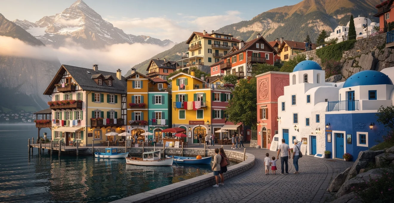
Hallstatt, austria: baroque facades and lakeside pastel palettes
Hallstatt’s chromatic identity emerged from 18th-century Baroque architectural influences combined with the practical constraints of lakeside construction. The town’s characteristic pale yellows, soft pinks, and muted greens reflect the Austrian tradition of using mineral-based pigments mixed with lime wash, which provided weather resistance in the humid lakeside environment. These colours weren’t arbitrary aesthetic choices but reflected the limited palette available from local earth pigments and the need for coatings that could withstand moisture while reflecting light into narrow streets.
The town’s UNESCO World Heritage designation in 1997 established strict colour preservation guidelines, requiring property owners to maintain historically accurate hues during renovations. This regulatory framework demonstrates how heritage conservation efforts balance authenticity with the practical needs of a living community. The preservation approach includes detailed documentation of original pigment formulations, ensuring that modern restorations replicate not just colours but also the texture and finish of historical lime-based coatings.
Hallstatt’s position receives approximately 10,000 visitors daily during peak season—a staggering figure for a town of 780 residents. This overwhelming tourism pressure has prompted discussions about visitor management strategies, including timed entry systems and seasonal limitations, raising questions about the sustainability of heritage tourism in small chromatic settlements.
Colmar, alsace: Half-Timbered colombage and polychrome shutters
Colmar’s distinctive appearance stems from the Alsatian colombage tradition, where exposed timber framing creates geometric patterns against brightly coloured plaster infill panels. This construction method, prevalent from the 14th through 17th centuries, created structural frameworks that allowed for chromatic expression while maintaining building integrity. The vivid blues, reds, greens, and yellows adorning these facades originally indicated the occupations of building owners—butchers favoured red, bakers used yellow, and fishermen selected blue, creating an intuitive navigation system in pre-literate societies.
The town’s colour regulations, established by the Architecte des Bâtiments de France, maintain this chromatic diversity within defined parameters. Property owners must select from an approved palette that references historical pigments while accommodating modern paint technologies. This approach demonstrates how contemporary preservation methodologies balance historical accuracy with practical maintenance considerations, recognizing that identical replication of 16th-century materials isn’t always feasible or desirable.
Colmar’s Christmas markets attract approximately 1.5 million visitors annually, generating significant economic benefits while straining infrastructure designed for a population of 68,000. The seasonal tourism concentration illustrates the economic dependencies that develop when chromatic heritage becomes a primary attraction, creating communities financially reliant on maintaining their storybook appearances.
Reine, lofoten islands: nordic rorbu architecture in crimson and
ochre
Reine’s iconic crimson and ochre rorbu cabins—traditional fishermen’s huts built on stilts along the shoreline—developed from pragmatic paint choices rather than purely aesthetic ones. Historically, these wooden structures were coated with a mixture of cod-liver oil and iron oxide, producing a deep red pigment that protected timber from the harsh coastal climate at relatively low cost. Over time, this utilitarian decision solidified into a regional chromatic identity, with red, white, and occasional mustard-yellow cabins forming a consistent visual rhythm against the slate-grey sea and dramatic, dark rock faces.
Unlike some Alpine villages with prescriptive colour charts, Reine’s chromatic cohesion is maintained more through cultural continuity and local building customs than formal regulation. The limited palette amplifies the contrast with the surrounding landscape, particularly during winter, when snow and polar light soften edges and intensify colours. As tourism has increased—Lofoten recorded over one million overnight stays in 2023—heritage-minded accommodation providers have restored and repurposed rorbu cabins for visitors, retaining original hues and simple forms while upgrading interiors for contemporary comfort.
Cinque terre, italian riviera: vernacular ligurian colour coding systems
The five villages of Cinque Terre—Monterosso, Vernazza, Corniglia, Manarola, and Riomaggiore—are often cited as textbook examples of coastal chromatic harmony. Their vertical clusters of houses in apricot, coral, lemon, and sage tones reflect a long-standing Ligurian practice of using mineral- and lime-based paints adapted to the humid maritime climate. Historically, colours helped fishermen identify their homes from the sea, creating a practical “visual address system” long before house numbers became standard. Subtle variations within a warm, Mediterranean spectrum ensured individuality without disrupting the collective waterfront composition.
Today, the Cinque Terre National Park and local municipalities regulate facade maintenance through detailed guidelines that specify acceptable colour ranges and finishes. Property owners seeking to repaint must often submit colour samples for approval, ensuring compatibility with historic tones and preventing the introduction of jarringly bright synthetic hues. Tourism pressures—over 3 million annual visitors to an area with fewer than 5,000 residents—have prompted additional controls on signage, balcony enclosures, and window frames, all of which can visually fragment the historic chromatic fabric if left unregulated.
For travellers, experiencing Cinque Terre’s storybook appearance means planning around peak cruise and day-trip arrivals. Visiting in shoulder seasons, staying overnight in one of the smaller villages, and exploring early in the morning or after sunset allows you to appreciate the nuanced colour transitions as light shifts across terraced slopes and harbourfronts. From the coastal trails or boat routes connecting the villages, the layered facades read almost like a painted elevation drawing, revealing how vernacular colour choices evolved in dialogue with topography and sea.
Mediterranean coastal settlements: whitewashed urbanism and chromatic contrasts
Mediterranean coastal towns developed distinctive chromatic strategies shaped by intense sunlight, heat, and maritime trade networks. Whitewashed volumes, bright accent colours, and reflective surfaces are not simply picturesque details but environmental technologies that mitigate thermal gain and amplify natural light. In many of these small towns, strict planning codes and informal community norms protect traditional colour schemes from rapid change, even as tourism and real-estate development reshape local economies.
The region’s most recognisable settlements—perched Cycladic villages, North African medinas, and Italian fishing quarters—demonstrate how white can serve as a dominant background against which saturated blues, terracottas, and lemons are carefully choreographed. These contrasting tones function as wayfinding tools, identity markers, and commercial signifiers. As we explore specific examples, we see how whitewashed urbanism operates like a giant reflector, bouncing light into narrow lanes while providing a neutral canvas for local colour traditions to stand out.
Santorini, cyclades: cycladic cubist architecture and aegean blue accents
Santorini’s famous blue-and-white palette emerged from both environmental necessity and 20th-century nation-building policies. The island’s cubic houses, carved into volcanic cliffs or stacked like geometric blocks, were traditionally coated in lime wash, which acted as a disinfectant and reflective surface in the hot, arid climate. The intense white surfaces reduce solar absorption, while deep blue domes, shutters, and doors reference both the Aegean Sea and Greek national colours, creating a cohesive visual identity that now defines global perceptions of Cycladic architecture.
Modern building regulations in villages like Oia and Fira strictly control facade colours, roof forms, and even the placement of pools and terraces. New constructions must visually integrate with the traditional cubist vocabulary, using approved shades of white and specific accent colours to maintain the iconic skyline. With Santorini welcoming over two million visitors annually—far outnumbering its year-round residents—these controls help protect the island’s visual integrity, even as infrastructure strains under the weight of cruise-ship arrivals and luxury hotel development.
For visitors seeking the island’s storybook atmosphere without overwhelming crowds, timing and route choices matter. Watching the sunset from lesser-known viewpoints, exploring interior villages like Pyrgos, or walking early along the caldera paths reveals subtler interactions between light, shadow, and colour. In those moments, the interplay of stark white walls, cobalt domes, and impossibly blue sea feels less like a travel cliché and more like a carefully calibrated environmental response refined over centuries.
Chefchaouen, morocco: indigo-washed medina streets and rif mountain context
Chefchaouen’s blue-washed streets have made it one of Morocco’s most photographed small towns, but the origins of its chromatic identity are layered and debated. Some accounts link the indigo walls to Jewish refugees in the 1930s, who associated blue with divinity and the sky; others suggest the colour helps deter mosquitoes or simply keeps homes cooler by reflecting sunlight. Whatever the origin, the collective decision to maintain blue facades has turned the medina into a cohesive chromatic environment where staircases, arches, and doorways blur into a continuous gradient of turquoise, ultramarine, and powder blue.
Unlike strictly codified European heritage districts, Chefchaouen’s colour maintenance relies heavily on local custom and community action. Residents regularly repaint facades before major holidays or tourist seasons, using commercially available paints in traditional shades. This ongoing practice keeps surfaces fresh but also raises preservation questions: how do you safeguard historic textures and pigment traces when walls are repeatedly coated? As visitor numbers have risen sharply—some estimates suggest over 200,000 annual tourists in a town of around 45,000—local authorities have begun considering more formal guidelines to manage signage, short-term rentals, and commercial conversions that risk diluting the medina’s visual coherence.
When you wander Chefchaouen’s stepped alleys, the town’s relationship with its Rif Mountain setting becomes clear. The omnipresent blue acts almost like a man-made sky pooled at ground level, softening shadows and visually cooling narrow lanes. It’s an example of how colour can reshape spatial perception: tight passages feel less oppressive, and modest houses appear otherworldly, as if you’ve stepped into a hand-painted illustration.
Procida, bay of naples: terracotta, lemon, and aquamarine fishing quarter typologies
Procida, often overshadowed by nearby Capri and Ischia, offers one of the Mediterranean’s most sophisticated examples of chromatic fishing quarter design. In the Marina Corricella district, stacked houses in terracotta, soft lemon, pale pink, and aquamarine rise directly from the harbour, forming a dense, almost theatrical backdrop for moored boats and drying nets. Local tradition holds that fishermen painted their homes in distinctive colours to recognise them from the sea, similar to practices in Cinque Terre and Burano, creating a practical visual code in an era before GPS or standardised addressing.
The island’s planning regulations now treat this harbourfront as a protected historic ensemble, limiting alterations to facades, window apertures, and rooflines. Repainting must respect existing colour relationships and use matte finishes that echo lime-wash textures, avoiding high-gloss synthetic paints that could disrupt the soft, diffuse appearance of the waterfront. Since Procida was named Italian Capital of Culture in 2022, increased visitor interest has underscored the importance of careful tourism management—balancing new hospitality ventures with the needs of a working fishing community.
For travellers, Procida’s storybook atmosphere is best appreciated at a slow pace. Observing how early-morning light flattens facades into pastel bands, while late-afternoon sun carves them into high-contrast planes, reveals why painters and filmmakers have long favoured the island. The chromatic dialogue between building fronts, boat hulls, and drying laundry turns an ordinary working harbour into a layered, lived-in canvas.
Burano, venetian lagoon: chromatic navigation systems in canal-side communities
Burano’s kaleidoscopic houses—painted in vivid magentas, limes, blues, and tangerines—might seem whimsical, but they evolved from very practical maritime concerns. Fishermen navigating the often-foggy Venetian Lagoon needed strong visual cues to locate their homes and mooring spots, so families adopted distinctive facade colours that remained consistent across generations. In effect, the island’s chromatic plan functions like an analogue GPS, turning each canal frontage into a clearly legible sequence of colour “coordinates.”
Today, Burano’s colour system is formalised through municipal regulations: homeowners must request permission before repainting and are assigned colours based on their property’s location and existing palette relationships. This prevents random repainting that could disrupt the island’s carefully balanced patchwork. The rules also reflect an understanding of visual saturation; bright hues are permitted, but their placement is orchestrated so that complementary and contrasting colours enhance rather than overwhelm narrow canalside streets.
As one of the Venetian Lagoon’s most visited islands after Venice itself, Burano grapples with the familiar tension between maintaining daily life and accommodating large numbers of day-trippers. If you visit, stepping just a street or two back from the busiest canals offers a different perspective, where laundry lines, small gardens, and quiet doorways reveal the ordinary routines underpinning the extraordinary colour. It’s a reminder that what looks like a movie set is, fundamentally, a residential neighbourhood shaped by centuries of pragmatic decisions.
Asian heritage towns: traditional pigmentation and cultural symbolism
Across Asia, chromatic traditions in small towns and historic quarters are deeply intertwined with religious symbolism, social hierarchy, and material availability. Colours are rarely neutral: specific hues can signal royal authority, caste identity, or protective beliefs, while also responding to local climate and light conditions. As these towns attract more international tourism, questions arise about how to communicate complex symbolic meanings to visitors without flattening them into simple aesthetic choices.
In many cases, the pigments used—whether derived from minerals, plants, or industrial processes—carry their own cultural and environmental stories. From Rajasthan’s pink and blue cities to Colombian towns influenced by Spanish colonial palettes and Indigenous motifs, chromatic identities are multi-layered. Understanding them involves looking beyond the surface to consider planning decisions, ritual practices, and contemporary politics of preservation and representation.
Jaipur, rajasthan: terracotta pink city planning and mughal aesthetic principles
Jaipur’s “Pink City” core is one of the world’s most extensive examples of coordinated chromatic urban planning. When the city was founded in 1727, it followed a grid-based layout influenced by ancient Vastu Shastra principles and Mughal town-making traditions, with broad avenues and organised bazaars. The now-famous terracotta pink tone was formalised in 1876, when buildings along principal streets were painted to welcome the visiting Prince of Wales; the warm hue was later codified into law, giving Jaipur’s historic centre a remarkably consistent visual identity.
The chosen colour—actually closer to a muted salmon or terracotta—cools intense desert light, softening shadows cast by arcades, jharokha balconies, and carved window screens. Municipal by-laws require buildings within the walled city to maintain this chromatic unity, specifying paint types and finishes that echo traditional lime plasters while accommodating modern materials. Jaipur’s inclusion on the UNESCO World Heritage List in 2019 strengthened these protections, linking colour preservation to broader commitments around skyline control, signage, and traffic management.
For visitors exploring Jaipur’s bazaars, the pink backdrop isn’t just decorative; it acts like a unifying stage set against which colourful textiles, spices, and jewellery stand out. Recognising the intentionality behind this palette helps us read the city not as a static museum piece, but as a designed environment where royal image-making, climate response, and commercial life intersect.
Guatapé, colombia: zócalo bas-relief artistry and antioquia regional polychromy
Guatapé, though geographically in South America, offers an instructive parallel to Asian chromatic heritage towns in how it uses colour and ornament to tell community stories. The town is renowned for its zócalos—painted bas-relief panels that run along the lower portions of house facades. These panels, often in bold primaries and saturated secondary colours, depict animals, trades, religious symbols, or abstract patterns, turning each street into a narrative frieze. The upper parts of buildings are typically painted in complementary tones, creating a layered polychrome effect unique to the Antioquia region.
The zócalo tradition, which gained momentum in the mid-20th century, has become both a local pride marker and a key tourism driver. Municipal initiatives encourage residents to maintain and innovate within this vernacular art form, offering small grants or recognition for notable designs. At the same time, there are emerging conversations about avoiding over-commercialisation—how do you keep motifs meaningful when souvenir demand pushes toward repetition of a few photogenic patterns?
Walking Guatapé’s streets, you can “read” the town’s history and aspirations in its colours: coffee plants, musical instruments, farm animals, and religious icons all appear in relief. For travellers, engaging respectfully might mean commissioning work from local artisans, joining guided walks that explain symbolism, or simply taking time to notice how colour and narrative work together rather than treating the town as a mere backdrop for photos.
Jodhpur, rajasthan: indigo-dyed urban fabric and brahmin quarter traditions
Jodhpur’s old town, often called the “Blue City,” offers a striking counterpart to Jaipur’s pink. Clustered beneath the massive Mehrangarh Fort, many houses in historic Brahmin neighbourhoods are painted in shades ranging from pale periwinkle to deep indigo. The original motivations for this practice are debated: some cite caste markers (Brahmin homes signalling purity), others point to the use of copper sulfate and lime mixtures to repel termites and cool interiors. Over time, these functional and social explanations merged into a powerful visual identity that now extends beyond any single community.
Unlike Jaipur’s tightly regulated pink core, Jodhpur’s blue areas have experienced more organic, sometimes uneven, colour maintenance. As tourism has grown and international media amplified images of the blue maze of streets, local authorities and conservation groups have begun advocating for more structured repainting campaigns using historically accurate pigments and finishes. Pilot projects have involved training residents in limewash techniques and offering subsidies for materials that approximate traditional indigo tones while complying with modern safety standards.
For you as a visitor, the blue alleys beneath Mehrangarh illustrate how colour can change not just how a place looks, but how it feels. Narrow lanes appear cooler and more serene, even in Rajasthan’s intense heat, much like stepping into the shade of a painted canopy. The town becomes a three-dimensional study in how a single dominant hue can unify an otherwise complex, irregular urban fabric.
Colonial and historic quarter preservation: pigment restoration methodologies
Protecting the chromatic character of historic quarters requires more than simply repainting facades in approximate tones. Conservation professionals increasingly rely on scientific analysis, archival research, and community consultation to develop pigment restoration strategies that respect both material authenticity and contemporary building standards. In many small towns, this involves uncovering multiple “colour histories” layered beneath modern coatings—like reading tree rings to understand past climates.
Common methodologies include stratigraphic paint analysis, where tiny samples are examined under microscopes to identify original layers and their composition. This can reveal surprising palettes: a facade now painted in subdued tones might once have featured far brighter colours, challenging assumptions about “authentic” historic aesthetics. Where true historical pigments (such as lead-based whites or natural indigo) are no longer safe or readily available, conservators work with manufacturers to create visually similar but chemically different alternatives, balancing health considerations with the desire to preserve characteristic textures and light-reflecting properties.
Another key element is documentation and guideline creation. Many heritage towns now maintain detailed colour charts and technical manuals that specify recommended products, application methods, and maintenance cycles. These tools support owners who may lack specialist knowledge but want to participate in preservation. Have you ever wondered why some storybook towns retain their charm while others feel over-renovated? Often, the difference lies in whether such shared frameworks exist and are widely understood, turning individual renovation choices into coordinated collective action.
Tourism infrastructure development in chromatic heritage sites
As colourful small towns gain visibility on social media and in travel media, managing tourism infrastructure becomes as critical as preserving pigments. Unregulated development—oversized hotels, intrusive parking lots, or brightly lit signage—can quickly undermine the very qualities attracting visitors. Effective strategies aim to integrate new amenities into existing urban fabrics, using design guidelines that extend beyond building facades to include street furniture, lighting, and even waste-management facilities.
Many destinations now experiment with visitor flow management to protect fragile streetscapes. Timed entry systems, capped daily visitor numbers, and incentives to visit in off-peak seasons help distribute pressure. In towns like Hallstatt or Cinque Terre, transport policies—shuttles from out-of-centre parking areas, limits on large tour buses, promotion of rail or boat access—also play a role. Think of it like calibrating the brightness on a screen: too low and local economies struggle; too high and visual and social details get washed out.
At the community level, there’s growing recognition that tourism revenue should feed directly into maintenance funds for public spaces and heritage buildings. Some towns introduce small “conservation contributions” on overnight stays or guided tours, clearly earmarked for facade repair, pigment research, or infrastructure upgrades. Transparent use of these funds builds local support, helping residents feel that they are partners—rather than passive backdrops—in the story their town is telling to the world.
UNESCO world heritage designation criteria for historic painted towns
UNESCO World Heritage status is often seen as a gold standard for heritage towns, but the criteria extend far beyond picturesque appearances. To qualify, a site must demonstrate “Outstanding Universal Value,” which may involve representing a masterpiece of human creative genius, bearing unique testimony to a cultural tradition, or being an exceptional example of a type of building or landscape illustrating important stages in human history. For painted towns and chromatic heritage sites, colour is typically embedded within these broader narratives, rather than treated as a standalone criterion.
Nomination dossiers usually detail not just current visual qualities, but also the evolution of colour traditions, associated building technologies, and governance systems that protect them. Management plans must address risks from climate change, overtourism, and inappropriate development, outlining concrete monitoring and mitigation measures. In practice, UNESCO inscription can bring both benefits and challenges: increased international recognition and funding opportunities, but also surges in visitor numbers and rising property values that may displace long-term residents.
For travellers, understanding this context can enrich visits to UNESCO-listed storybook towns. When you stand in a pastel alpine square or wander through indigo-washed alleys, you’re not just witnessing a photogenic backdrop, but a living cultural system shaped by environmental knowledge, social organisation, and global heritage debates. Asking how colour came to define a place—and how it’s being protected today—turns a simple sightseeing stop into a deeper exploration of how communities write their stories in pigment, stone, and light.